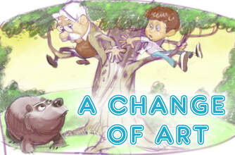
36. A Change of Art
Ideas for updating AIO album covers.
By David Hilder | June 22, 2019
Ideas for updating AIO album covers.
By David Hilder | June 22, 2019
One of the first things we learn about an album, after its title, is the colorful, cartoon artwork featuring the characters we all know and love. Do you remember the anticipation before Album 51: Take It From the Top came out? During that time the cover art was revealed on a podcast with artist Gary Locke. The art features Connie cutting Eugene’s hair with an electric razor, revealing his periwinkle blue eyes for the first time. How Katrina was able to see his eyes underneath all that hair and Eugene’s pair of smudged glasses will always be a mystery. That cover reveal was a big moment and it was also symbolic of all the changes that were about to hit the show during this album. We’ve been seeing a lot more artwork lately, what with albums being split into six episodes each and every AIO Club episode getting its own artwork. Most of the time the art works well. But sometimes it leaves something to be desired.
This editorial isn’t meant to be a complaint about Gary Locke’s style, which is big, bold, and decidedly cartoonish. Instead, I’m going to focus on the content of the artwork—the characters and scenes the covers depict. The Adventures in Odyssey team has admitted before that some of their album covers have been lacking in imagination. The old cover for Album 18: A Time of Discovery, for example, showed nothing but a cluttered desk. In recent years the title of Album 2 was changed from Stormy Weather to The Wildest Summer Ever and the art was changed from a confusing reaction shot of Whit and Tom Riley looking shocked to a more exciting scene of Whit and the boy Donny being chased up a tree by a bear. That was a good decision. It makes it easier for a parent going shopping to pick up the album and understand what they’re getting.
My outlook is that an album cover doesn’t necessarily need to depict a real scene from the album. Instead, it should at least be a good representation of the album as a whole or at least a prominent episode. The cover of Album 25: Darkness Before Dawn, for example, has an ominous picture of Mr. Blackgaard gazing menacingly at the little town of Odyssey and Whit’s End in particular. It's a scene which doesn't happen in the show, but it's still a great representation of the feel of the album. That said, sometimes an actual scene from an episode can work perfectly. Album 12: At Home in Abroad has Eugene in the arena being chased by a bull and Album 23: Twists and Turns has Rodney shattering through the skylight at Whit’s End. These scenes give us a sample of the kinds of things to expect on the album. On the other hand, just because an album’s artwork depicts a real scene doesn’t make it a good cover. Let’s go over the covers that deserve an update.
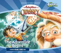
Album 1 is a lot of peoples’ first impression of Adventures in Odyssey. What better place to start listening than at the beginning? The message the current cover sends is that AIO is apparently a show about exploding photocopiers which shoot out flying pizzas and bolts of lightning which terrify any kids that come near. It’s true that Whit’s End can get pretty crazy at times, but it doesn’t quite rise to that level in Whit’s Flop. Needless to say, the cover does not represent the album well. Album 1 isn’t really about Davey Holcomb or Whit’s inventions. I think a much more important event to memorialize on the album cover would be Connie Kendall’s introduction to Whit’s End. Connie and Whit’s first scene together is perhaps one of the most important chance meetings in AIO history. Just think if Connie had asked someone else for directions to Front Street. It's pretty much impossible to imagine the show without Connie. Some artwork of Connie putting on an apron or Whit giving her a tour of his crowded shop would be the perfect way to introduce listeners to the world of AIO for the first time.
Right now the cover of Album 4 features a scene from A Matter of Obedience in which a young Tom Riley balances on a bridge. As album covers go, it’s all right. But I’ve always had another image in mind for this cover that I think would be hilarious. Okay, hear me out. In the episode Let This Mind Be in You, Whit goes away and leaves Connie and Eugene in charge of the shop. Connie decides it’s her job to take over Whit’s role and imitate him in every way. She doles out advice and even puts on a Whit-style sweater, which is a big deal for Connie because she’s obviously partial to her classic green sweater. An image of Connie dressed up like Whit with a crowd of kids around listening to her sage wisdom would be great. You could even exaggerate her costume and give her Whit’s jacket, glasses, and even a fake mustache and wig to enhance the effect. Connie wearing a Whit disguise would be entertaining, yes, but it would also highlight the album’s focus on teaching and learning, and how our characters make plenty of mistakes in the process.
Album 6 has a lot of good possibilities for an updated cover. The current one doesn’t work because it isn’t clear what the characters are doing. It’s just Whit, Connie, and Robyn Jacobs staring into space. Album 6 is supposed to be about being on a mission or a quest, whether that means being a missionary or solving a mystery. An updated cover could feature Jack Davis in a trench coat as he stumbles onto Wonderworld for the first time, or Jimmy Barclay in the jungles of Nicaragua, or Grover and Able McAlister racing through the backcountry, or John Avery Whittaker in the navy, or even a better image of Robyn following the clues to find the treasure of Le Monde. Any of these would work well because they would give an accurate representation of all the excitement and questing that goes on in this album. Anything would be better than the rather dull cover we have at the moment.
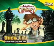
As much as I’m a fan of the hilarious Album 30 episode in which Eugene nearly goes insane as Bernard continues to beat him at chess, I don’t think the right effect comes across in the album artwork. The giant chess pieces seem out of place and may even mistakenly lead listeners to think the album is connected to the Blackgaard Chronicles, which uses chess as a metaphor for the conflict between good and evil. But more importantly, it doesn’t represent the album well. Album 30 is about going through tough situations and the current cover looks more like a parody of that theme. I think an image of the tornado touching down in the town of Odyssey would be more appropriate. Not only is the tornado a major event in one of the episodes, but it also serves as a metaphor for the trials that our characters face in an album aptly titled Through Thick and Thin.
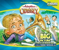
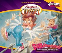
Album 35 introduces the Novacom Saga to us, but you wouldn’t know it from the album artwork. Right now we have an image from Worst Day Ever, in which Mandy Straussberg experiences one disaster after another. That’s an all right topic for an album cover, but it could be better. I think AIO should take some inspiration from the previous Album 35 cover, which featured a more sinister scene with Arthur Dent showing Mr. Whittaker on a map where Novacom plans to build their radio tower. That would be a more fitting way to kick-off AIO’s most ambitious saga. Another thing I have to say about the current cover is that Mandy’s face doesn’t look quite right. She has a look of consternation, which is kind of off-putting. Mr. Whittaker has his own version of consternation on Album 1, which is just as off-putting. It sends the message that maybe you should give this person some space and not talk to them, which isn’t the best from a marketing perspective. Expressions of fear are fine, like Robyn on Album 9 or Eugene on Album 12. Fear is exciting. But there’s something about an expression of consternation which is anything but inviting.
Album 39’s artwork isn’t too bad. It has Edwin Blackgaard performing a stage play, but mainly serves to introduce the Washington family to Odyssey. But there’s an opportunity here to add something that we’ve been missing. The album features the episode For Trying Out Loud, in which Wooton helps Edwin Blackgaard to put on a play at the Harlequin Dinner Theatre. I think the only reason the album art doesn’t feature Wooton is because there was a practice at that time of intentionally not drawing Wooton. His character design was not revealed until after the 2010 reboot. So it’s probably time to revisit this album cover and put our favorite mailman in the spotlight. Give us Wooton Bassett on stage bedecked in full Elizabethan garb and we’ll be happy.
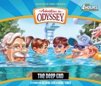
Album 55 does not match its cover in any way. The cheerful artwork makes it look like our friends in Odyssey are enjoying a nice pool party, when in reality the episodes on the album are much more serious. Entering the mire of London’s criminal underworld, fighting in the trenches of World War I, and Eugene and Katrina coming to the painful realization that they can’t have children are all things that don’t really go well together with a dip in the pool on a hot summer day. I’m sure the only reason for this artwork is because it matches the album title, which it does in a superficial way. It’s a metaphor for the deep situations in the album, but I don’t think it was thought through very well. For the updated cover I would suggest an image of Jason skulking through London, with a view of Big Ben and the River Thames in the background. That would connect to the water metaphor without being too heavy-handed and would also serve to accurately represent the album’s episodes.
This is not an exhaustive list of album covers, but it highlights a number of covers which would really improve with a redesign. The colorful artwork is the first thing you notice about an Adventures in Odyssey album. Even though AIO is an audio drama and shouldn’t really be affected by how its stories are represented as images, the art does have an effect on how many people are going to pick up the album in a store. Cover art has the ability to draw us in, to intrigue us, and to excite us about all the adventures to come. But if done without enough thought, the art can also push people away. That does a disservice to everybody involved in creating such great episodes. Adventures in Odyssey deserves album art that reflects its caliber as a top-quality audio drama.
This is not an exhaustive list of album covers, but it highlights a number of covers which would really improve with a redesign. The colorful artwork is the first thing you notice about an Adventures in Odyssey album. Even though AIO is an audio drama and shouldn’t really be affected by how its stories are represented as images, the art does have an effect on how many people are going to pick up the album in a store. Cover art has the ability to draw us in, to intrigue us, and to excite us about all the adventures to come. But if done without enough thought, the art can also push people away. That does a disservice to everybody involved in creating such great episodes. Adventures in Odyssey deserves album art that reflects its caliber as a top-quality audio drama.
This site is in no way affiliated with Focus on the Family. "Adventures in Odyssey" is a registered trademark of Focus on the Family.
